Optimizing Checkout
Eliminating friction in checkout and sign in process
Time Frame: 10.2023—12.2023 Client: Chatbooks My Role: UX/UI Design Collaborated with: PM, UXR, Developers, Analytics—
Overview
At Chatbooks our main demographic of users are busy working millennial mothers. They are interested in finding an easy way of getting their photos from the camera roll and into a photo book. With all the demands on their time it is especially important to make each experience as easy as possible.
—
Helpful Context
96%
of customers identified as women
75%
of customer work full time jobs
61%
of customers have children under 3
In 2023 I worked on the Shop team. One problem we wanted to solve was the user’s transition from buying a book on our website to building that book in the app. As we audited current experience, two things did not feel easy:
—
Problem Statement
The current web checkout was long and arduous, especially for new users.
The first step in the flow was to create an account or sign in. Many people would customize a product and then abandon the flow at this point. Even those with accounts found it hard to remember their information to sign in. The sheer number of steps was also overwhelming. Some of the UI was questionable as well. For example, the payment input fields looked different from the rest of the UI potentially causing people to wonder if this was a secure site.
—
Problem Statement Cont.
Logging in was so hard for users that it was preventing them from working on books they had already paid for.
Although we offered single sign-on options, the majority of users were using a password and email to sign in. This added friction was alarming to me for two reasons:
It could prevent people from logging-in and printing the books they have paid for.
Unprinted books that customers paid for meant unrecognized revenue for Chatbooks.
—
Reduce friction and increase ease in the checkout and sign-in processes to decrease drop-off
Goals
Meeting this goal would allow Chatooboks to:
sell more books
and recognize previously unrecognizable revenue
—
Research
I started with competitive analyses. I gathered ideas of what could work well at Chatbooks from leaders in e-commerce. I involved developers on my team to understand what steps were unnecessary in our current flows. What could we strip out if anything? The user research team helped me with a survey to understand what types of express pay our users use and expect. They also conducted user interviews to understand users’s current frustrations with logging in.
10
Competitive Analyses
700+
Survey Participants
5+
User interviews
—
If we had a user's email, we didn’t need to make them create a password.
Express pay options that are most used by Chatbooks customers are Apple Pay, PayPal, Shop Pay, and Venmo. The ones most requested were: Venmo and Apple Pay.
Some of my favorite findings from competitive analysis:
Learnings
Place express checkout at the beginning to allow users to bypass account creation.
Email or text validation (magic links) could be a way to bypass passwords completely.
Checkout Designs
My goal with the designs was to simplify the checkout process as much as possible. I optimized for anything that would help the user checkout quickly and painlessly.
—
-
From the flow I inherited:
Users are dropping off because they have to make an account.
The many steps are visually overwhelming.
UI was inconsistent, and the bottom sheets made the experience disjointed.
-
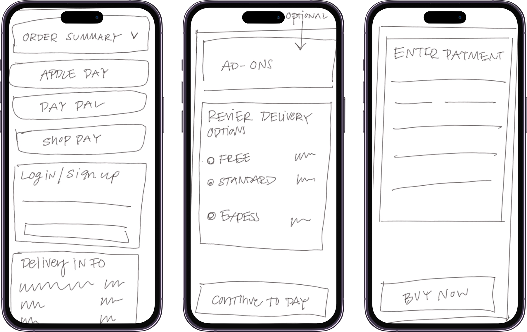
Simplified the process to 3 steps,
Review order and login
Select delivery options
Enter payment and buy
I broke up what needed to be done into digestible chunks to reduce overwhelm.
-
Could the process could be quicker?
Also was there a way to bypass customers making an account?
V1 | Checkout flow
Step 1 Step 2Step 3V2 | Checkout flow
-
I still felt like the process could be quicker.
The section reviewing the details from the previous screen took up a lot of space; was there a way to avoid this?
Was there a way to bypass account creation?
-
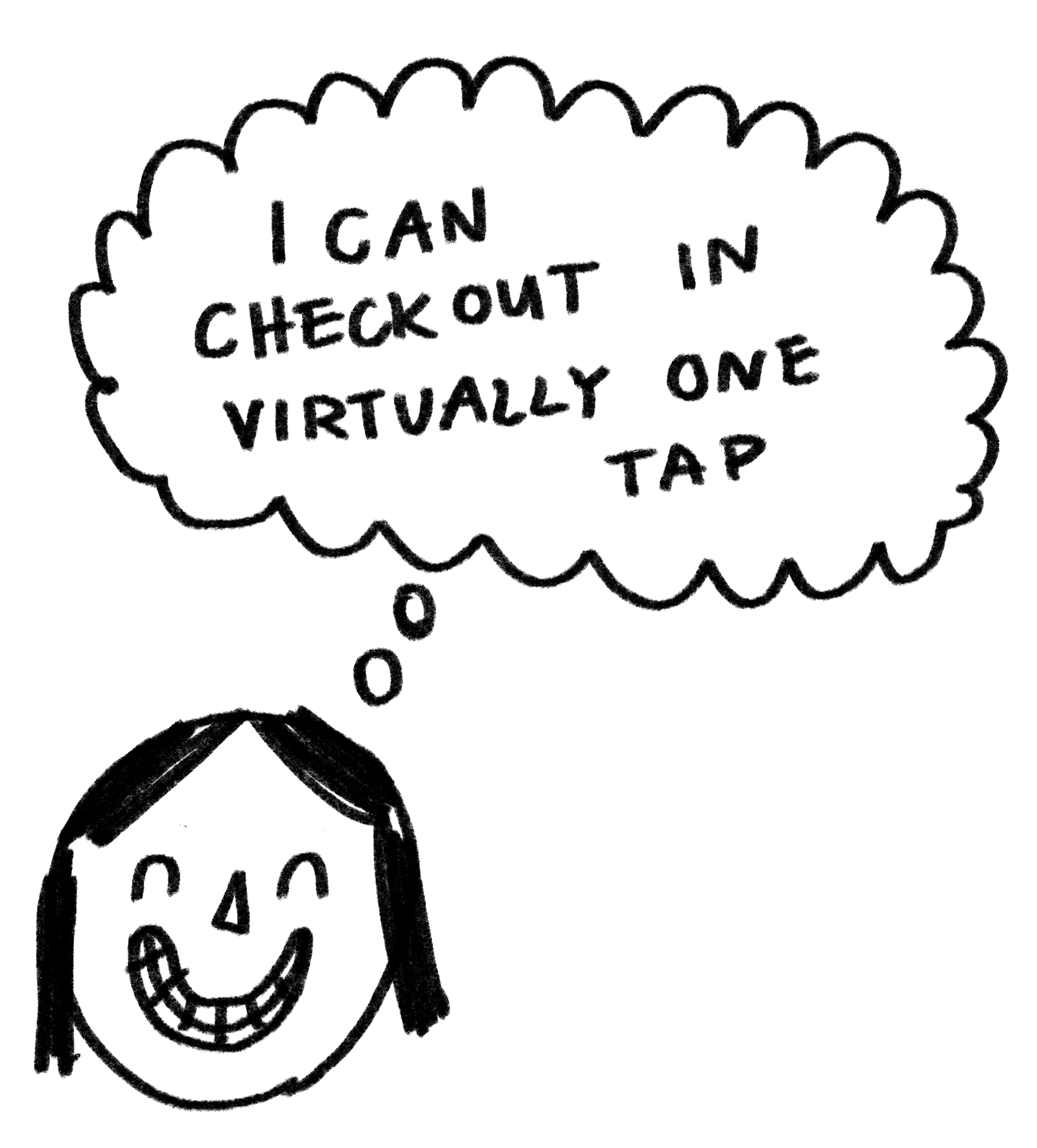
I optimized for express checkout, allowing users to checkout in virtually one tap by moving those options to be the first step and keeping the buttons colorful and big.
If they still chose to enter payment details in manually instead of express checkout I only required them to give an email, rather than set up an entire account.
-
You have to scroll a lot in every step it starts to feel a bit overwhelming.
Perhaps a stepped approach would feel more successful if each step had limited or no scrolling?
Step 1 Step 2V3 | Checkout flow
-
You have to scroll a lot at every step and it starts to feel overwhelming.
Perhaps a stepped approach would feel more successful if each step had limited or no scrolling.
-
I condensed the 2 steps into 1 single step to the most clear, most frictionless experience.
Only 1 stepSign in Designs
—
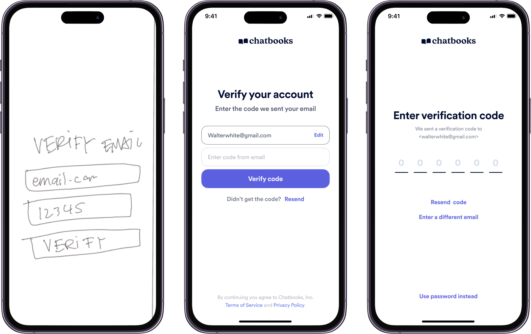
From user interviews, it was clear that our customers don't remember their passwords. What if we only used a “magic link” where all a user needs to do is verify an email with a code?
-
V1 (first screen) needed more attention to detail. What happens if a code doesn’t send?
v2 (second screen) needed clearer directions, what email is this code going to?
The UI could be a bit more descriptive as to how many digits the code should be.
-
Improved UI to prime the user with what exactly to type in.
I reduced the noise on this critical screen by having the email gathered on the screen prior, so this screen can just focus on entering the code.
V1V2V3—
Solution
Not only are these new designs visually more simple, but they allow new users to easily glide through the checkout process, even when they need to enter in payment and shipping info.
Old designsNew Designs—
Outcomes
Conversion increased 6% after these changes wee made. As of September 2024, the conversion metric was still climbing.
—
Next steps
Many people mentioned shop pay in the survey it was the 3rd highest requested express pay option. The only reason it is not reflected in the designs is because a contract with Shopify didn’t make sense for Chatbooks at the time. But someday I think that would greatly help conversion
Auto-filling addresses and other fields is something I didn’t have time to explore before I moved teams. This is something I would love to make sure is working seamlessly in checkout as another way to make it just a bit easier to checkout.


